
Redesigning UC Berkeley Extension - Home Page
ABOUT UC BERKELEY EXTENSION
UC Berkeley Extension is the continuing education branch of the UC Berkeley. UC Berkeley Extension offers professional certificates, professional programs, Bootcamp and programs for international students.
THE PROBLEM
UC Berkeley Extension wants help in increasing the discoverability and enrollment in their UX Certificate program from the homepage https://extension.berkeley.edu/
MY ROLE
I worked as the UX designer and researcher and conducted the project from beginning to the end. I conducted tear-downs, usability tests, created sketches and wireframes and created the hi- fidelity prototype to conduct usability tests.
THE SOLUTION
The redesigned website resulted in improved discoverability of the UX certificate program.
TIMELINE: 1 week
THE PROCESS

SCOPE OF THE PROJECT
As a UX designer and researcher, the project scope includes to find areas of opportunity to improve the KPI’s by redesigning the home page and UX certificate course detail page .
ASSUMPTIONS
-
UC Berkeley wants to promote the program on a high priority by featuring it on the home page.
-
By improving the navigation to the UX program, student enrollments will increase.
-
I am assuming that the management and the researcher has sufficient cause to believe that UX Design falls under the category of ‘Art and Design’ based on the courses it delivers.
-
Enrollment for this project means to add a course from the UX design program to cart, checkout and pay the course fee.
EMPATHISE
USER RESEARCH
1. COGNITIVE WALKTHROUGHS (TEARDOWNS)
-
I conducted a teardown, assuming that I am a student who currently wants to enroll in the certification course for User Experience design at UC Berkeley Extension.
-
I looked at different ways to get into the UX Design program details page from the landing page.
-
I started from the home page and continue till the checkout page .
Below are a list of Observations found in this process:
OBSERVATIONS
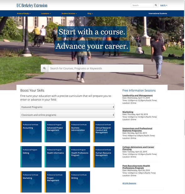
The first thing I see is the search bar. I will probably have to search for it here
Once I am on the homepage, I am looking for anything which says User Experience (UX) design.
There is nothing on the featured programs listed on the homepage relating to UX design course.

First item on the search result is unrelated to UX course.
Are these individual courses or are they programs/ certifications?

The drop-down for "Areas of Study: doesn't provide enough information scent. Is
UX under Art and Design or
under Technology &
Information Management?

Selecting the "Art & Design" category brings you to the landing page which contains the User Experience Design in the bottom.

The UX Program page has a wall of text. Too much information
to read. Users want to know how many courses and how much it is going to cost.
All the required courses are pushed to the side. These details can be ignored by the user since these looks like ads or related links.
FINDINGS FROM COGNITIVE WALKTHROUGH (TEAR-DOWN)
-
From the homepage of UC Berkeley extension website, there is no direct way to view the details of the User Experience (UX) Design program
-
The drop down from the navigation bar does not give enough information on the location of the UX Program.
-
A User has to go through 2 layers before finding the UX program.
-
The UX program is not listed on the featured programs list on the Home Page.
-
When ‘UX’ is typed into the search bar, User Experience (UX) design program does not show up in the first few prompted results.
-
Once inside the UX program details page, the information is overwhelming and there is no direct course schedule to plan the order of taking the classes.
-
The user has to go individually into the courses to see their availability, the cost,the timings and the days they are available. This makes planning difficult.
USER FLOW

2. USABILITY TESTING
The next step was to conduct Usability testing to understand the frustrations and pain points of people who have not used the website before.
Research questions:
-
Is the UX certification program easy to discover from the home screen?
-
Once on the UX certificate program page, can the user easily understand the curriculum detail and enroll?
Research methodology - Usability testing
Tasks:
-
Navigate from the home screen to see course details for the User Experience (UX) program.
-
Show me where the list of courses are located.
-
How much does total program approximately cost?
-
Check the details for Visual design and select the option which is suitable for your schedule
-
Add the selected course to cart.
Participants: 3 users who know to work with a laptop with either mouse/trackpad.
OBSERVATION
-
All the users went back and forth before finding the UX program
-
2 users clicked on Areas of Study and went directly to ‘Technology and Information Management’ . 1 user who navigated to ‘Technology and Information’ selected the UX/UI bootcamp course (not the UX professional program)
-
Once on the UX program details page, 2 of the users found it difficult to understand the total number of required courses and elective courses to complete the program
-
All the users took some time to understand that the name of the courses were on the right side of the page.
-
All users were able to complete login easily
INTERPRETATION
-
It is not intuitive to find the UX Program from the home screen.
-
People get confused and click on ‘Technology & Information Management’. There seems to be different interpretation of which branch/category UX program falls under.On the homepage, from the drop down, there is no visibility of what programs fall under the broad categories like “Art and Design’
-
The UX program page has a lot of written information in the center of the page. It is overwhelming for users to find a summary of the course requirement, the duration taken and estimated course details.
-
Placement of the courses is not intuitive as users tend to focus on the center of the page for main information.
FINDINGS:

The UX Program must be under Technology and Information Management
I wish it could tell me which courses was categorized under ‘Art and design’ without having to click on it
ANALYZING THE PROBLEM
Discovery Problem:
Users are finding it difficult to discover the UX Program from the Home page. This could be due to one or more of the below:
-
Site Visitors do not notice the navigation bar with the main course category under which the UX program is located - UI related
-
Site visitors cannot find the course because of the naming given to the headings in the home page - Information Architecture related
-
Site Visitors do not know about the availability of the UX Course in UC Berkeley - Marketability issue
-
Ability of the search tool to give optimum results with top-keywords used - SEO Problem
Enrollment Problem:
This can be due to one or more of the problems below:
-
The website’s overall health, content, and ease of use. This is the first barrier on a path to better conversion rates.
-
Checkout flow not easy to understand and navigate.
-
Absence of Financial Aid could be a reason for lower conversion rates.
-
Absence of a quick way to get answers for queries, like on-line chat feature. Students prefer to have an easy and quick option to get their queries answered.
OPPURTUNITIES FOR IMPROVEMENT
I categorized the recommendations for improvement based on the task flow an user takes to complete enrollment in the program:

FEATURE/SOLUTION PRIORITIZATION
As per the goal and scope of the project, considering time and money, the final solutions were prioritized on the basis of urgent and important features. I made sure that it doesn't require a lot of time and budget to incorporate.

SOLUTION PROPOSAL
1. Increasing visibility of the User Research Program on the navigation bar.
A/B test:
I created 2 mockups to show multilevel drop down menu, which shows all programs covered under an Area of study. I performed A/B testing to observe usability and discoverability of the program
A

B

Observation: User's noticed the navigation bar more quickly in option B. Users mentioned that Option B did not block other items on the navigation bar, while expanding
2. Promoting the User Experience Program by featuring it on the home page.
I created a category which shows Trending Programs in a carousel.
BEFORE

AFTER

UC Berkeley can use this area to feature other programs they may want to promote.
3. Program overview and details on the Program Details page to be made more clear and concise to help students understand and plan better for scheduling their program structure.
BEFORE
AFTER

Clearly mentions number of Units required to complete the certification course

Created accordions to clearly categorize information . Overview section has important program overview information detailed in a tabular form

Brought all the courses to the center of the page in a Tabular form. Categorized courses into "Required" and "Electives"
Added Register Now Button to help students begin enrollment process
CONCLUSION
Based on Usability tests conducted on these redesigned mockups:
- All the users were easily able to find the course from the Home-page.
- All the users identified the required and elective courses and understood the course structure and fees.
- All the users were able to locate the "Register Now" button to begin their enrollment process.